
iPhone app design involves a lot of moving parts and processes. Building a new iPhone application takes a ton of work and there are plenty of moving parts involved in the process, but designing an app for iPhone is also where things get fun. After all, there’s nothing more satisfying than seeing your idea fleshed out on a screen, looking just as you imagined it.
What a lot of people don’t realize is that there is a whole lot more to design than making things look pretty. You have to consider things like user experience as well as how users will interact with your app. Designing for mobile is a whole other process than designing for desktop.
Mobile app development is one of the biggest industries out there, with nearly 197 billion app downloads in 2017. If you want to tap into this lucrative ecosystem and launch a successful iPhone app, it’s crucial to get things like the iPhone app design right.
In this article, we’ll take a look at everything that comprises great mobile design, some examples of when it works and when it doesn’t, and how it can impact your users.
One of the very first things to realize is that designing an application for mobile is very different from designing for desktop, and a lot of people getting started with their first mobile app do not fully consider the huge shift in mindset it requires.
The most obvious key point when it comes to mobile design is that apps have a very different user interaction interface than websites. This includes things like tapping on your phone instead of clicking, working with more buttons instead of links, and so on.
Another thing to consider is that on a phone, you want to present the user with less information and content than you would on a larger device, such as tablet or desktop, since the view is smaller.
Navigation is another important component that works differently on mobile. On a website, users are used to clicking the back button on their browser. On mobile, users expect the app itself to offer an easy-to-find back button (traditionally found in the top left of the screen).
Keep in mind that tradition is key. Stick with what users know and are comfortable with rather than shaking things up for the sake of a snazzy new design. Ease-of-use should always come first.
The last thing to consider in regards to understanding the medium is that if you’re building an iPhone app, you should ensure it looks good and performs as expected on all iOS devices, which takes us to our next point.
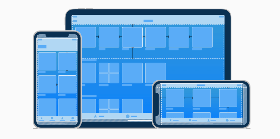
Keep in mind that iOS devices come in an array of different pixel densities, color reproduction, some have Retina, some do not—which you should always factor in when designing your app. Get an accurate idea of how your app will look by viewing it on every iOS device.
Bring in a Dev
Even if you aren’t ready to start coding your app, it’s always a good idea to introduce a developer to the project early on and keep them involved in the design process. Promoting a collaboration between your developer and designer from the beginning will give your developer time to work out and solve complex problems they may find in the designs and prototyping.
Another advantage to this is that developers have a greater understanding of iOS than anyone else, so they can more easily spot elements in the design that might not work well with the mobile operating system.
iPhone Human Interface Guidelines
If you’re working on designing an app for iPhone, there are some essential human interface guidelines you should consider, which you’ll notice popular iOS apps adhere to. This includes incorporating themes of clarity, deference, and depth.
- Clarity – means your app is easy to read, with legible text, easily interpreted icons, and an overall sharp focus on functionality. All of the space on the screen is optimized to enhance important text and graphics so users can easily understand the app and navigate it.
- Deference – refers to the app being both beautiful in design and fluid in terms of layout and content interaction. Design elements like gradients, bezels, and drop shadows work together to enhance the content.
- Depth – provides clear and distinct layers that give content and design elements in the app depth, such as a button with a shadow, making it appear to pop out of the screen. This enhances touch elements for users and provides a sense of depth to your design.
Anyone can build an app, but not everyone can create an experience for users. UX and UI are fundamental design concepts that embrace promoting the best in both user experience and user interaction to not only capture the user’s attention, but consistently present them with content and interfaces that are flawless, fast, and beautiful.
Anyone can build an app, but not everyone can create an experience for users. UX and UI are fundamental design concepts that embrace promoting the best in both user experience and user interaction to not only capture the user’s attention, but consistently present them with content and interfaces that are flawless, fast, and beautiful.
While UX and UI are closely intertwined, they are also distinct in their professional roles. UX is all about creating a seamless experience for users through ease-of-use, usability, and overall satisfaction when interacting with an application. Great UX is achieved through a process of wireframes and prototypes of the app, user research, and scenarios.
UI complements the user experience by visually guiding them through the app by way of a variety of design elements, such as buttons, colors, and layouts.
Simply put, UX focuses on how things work while UI focuses on how things look.
UX and UI Done Right
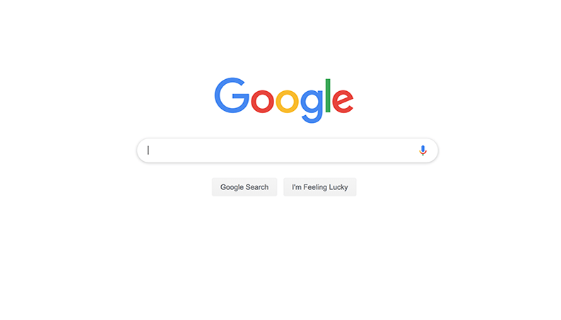
Let’s look at one of the most obvious examples of ingenious UX and UI — Google. When Google first hit the scene, we had search engines like Yahoo and AOL that offer a cluttered page with a search bar. Google really changed things up with their super simplistic approach of using a blank page with just a colorful, eye-catching logo and a url bar.
It’s intuitive and users can use the search bar without being pulled away by other content on the page.
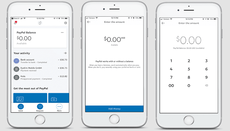
PayPal also takes a simplistic approach, which is perfect for an app that aims to let users send money quickly and easily. It makes use of colors to highlight important text, such as red for notifications and blue for important content on the screen.
You can easily find friends, who have images next to their name, and icons clearly and easily convey a function, such as Sending Money, Requesting Money, and More.
UX and UI Done Wrong
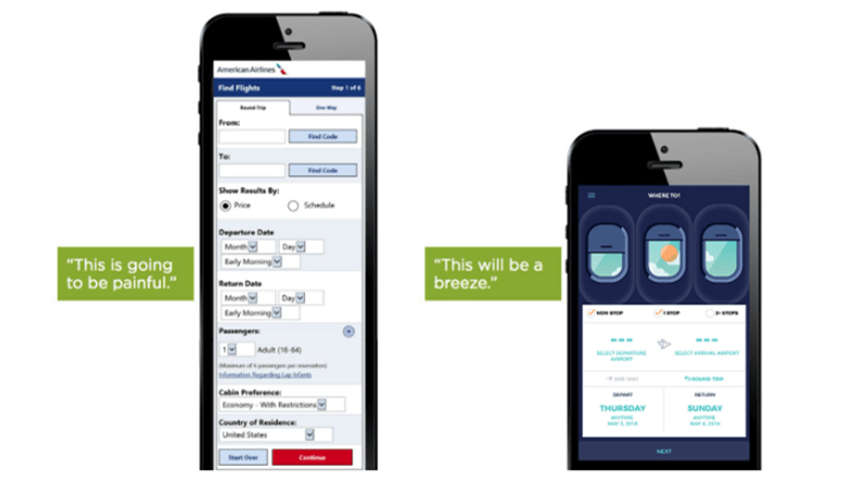
Take a look at the mobile form on the left from American Airlines. Does this look like something you’d want to fill out? Probably not. A lengthy form is a big UX faux paus and leads to a high drop off rate. Forms on mobile should always be as short as possible, like the one on the right.
Check out this website for a China tours company. Right off the bat you can see an issue with the text on the page—a gray background with gray text. There isn’t much contrast here and it makes the content hard to read. Additionally, the red and blue in that same section do not compliment each other.

At this point, you can probably tell how important design is. Every single item on the screen is taking up valuable real estate and should be placed with precision and care. Now that you have some design basics down, the next step is to start prototyping!
This involves mapping out your app and is also known as “wireframing”. This process gets into the structural design of your app by using online tools or programs to lay out the content and functionality your app will have.
This step in designing your iPhone app is crucial and will demonstrate both the design elements and functionality that will exist on various pages. This bring to the table a visual understanding of the app early on which you can then take and present to other team members, such as developers.
There are tons of great wireframing programs you can find online, some free and some that charge, such as Adobe XD, Sketch, Balsamiq, and plenty more.
Getting an app store developer account costs $99 per year and is a necessary step to get your app listed in the Apple App Store. You can save this step for last, when you’re ready to launch your app, but it’s actually a good idea to get started earlier so you can get a head start on some useful resources and development tools they offer.
Embarking on the design phase of an iPhone app is both an exciting and creative venture, but give it the time it’s due. Great design and fluid mobile functionality does not happen overnight, but rather takes careful consideration and time.
If you’re coming from a desktop web application background and this is your first mobile app project, you’ll need to get into a whole new headspace in terms of how you think about design. Spend time playing with different prototyping and wireframing tools or even start off simple with some sketches to flesh out your designs. Allow early collaboration between your designers and developers, and above all, enjoy the process and soak up the learning experience!