Updated
11 min read
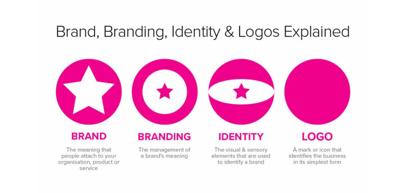
What are Branding and Identity Design Services?
Having a cohesive brand image is a must for any app, regardless of what industry you’re in.
Effective app design elements are a great way to communicate your brand identity to your users.
So why is brand design important?
When you have a strong brand identity, it helps you develop customer brand loyalty and brand awareness.
It builds an emotional connection with your users, making them more likely not only to continue using the app, but to discuss it with other people in their life.
When selecting an app, many people make initial decisions based on visual brand design elements, like icons, buttons, and so much more.
A strong brand identity helps to set you apart from the competition, particularly in today’s crowded app market.
So let’s discuss the most essential elements of branding and identity design services for mobile apps so you can move forward with launching your app with success.

Step #1: Understanding Your Target Audience
Before you get to work on the essential elements of your brand design, it’s important to first understand your app’s target audience.
Developing this understanding will help you better connect with your users through your branding.
The more specific you can get with your target audience, the better.
Consider factors like age, gender, cultural background, and socioeconomic status.
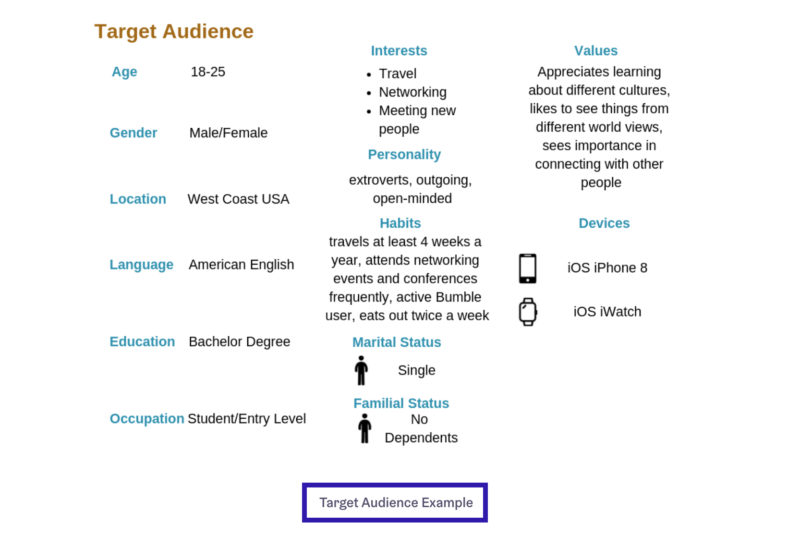
You should also consider their interests as well as the type of challenges they face.
How will your app fit into their life? What problems will your app solve?
Once you have a defined target audience, you should keep it in mind throughout the brand development process.
When putting together essential brand elements like a company logo, typography, and messaging, consider how it will resonate with the end user.
Step #2: Develop Your Messaging
Many people think of brand design as purely visual, but your messaging is an equally important consideration.
Your messaging communicates what the app does and how it benefits the user, and it informs the visual elements of your brand design.
One strategy that can be very helpful when developing your brand messaging is thinking of your app as having a human personality that customers interact with.
For example, your app might be bubbly, social, and fashion-forward, or it could be sleek, professional, and knowledgeable.
Defining your brand’s personality traits is a great way to inform your brand’s voice as well as your visual design elements.

2.1 Value Proposition
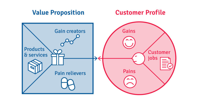
One of the most important elements of brand messaging is your value proposition.
Your value proposition is a short piece of text, usually just a sentence or two, that defines what your app does and why people should use it.
Value propositions are traditionally used for advertising, and in many cases are the first thing that your customer sees when interacting with the brand.
It needs to be compelling in order to get your customers truly engaged.
2.3 Mission and Vision Statements
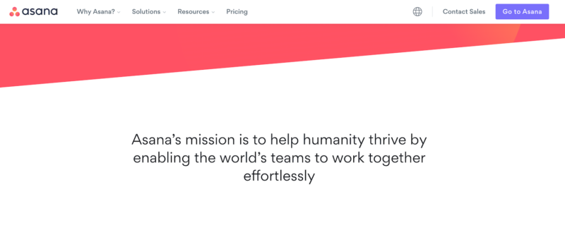
Another key piece of your brand messaging to define here is your app’s mission and vision statement.
Your mission statement communicates what your app does, how you do it, and who you do it for.
Your vision statement communicates where you want the app to go in the future.
While these statements can be important for potential customers, they’re equally important for you to use internally when putting together your brand design.
Your mission and vision statements can keep you on track as you work to create a cohesive brand identity.
2.4 Brainstorm
When developing your brand’s messaging, it’s important to brainstorm with your team and get multiple perspectives.
Having multiple voices in the room can spark unique ideas that you may not have thought of on your own, and can also help you spot potential pain points as you put together key brand messaging components.
2.5 Feedback
Getting feedback from potential customers using strategies like A/B testing can be very helpful.
Ultimately, the app needs to resonate with your target audience, so you should check in with them throughout the brand development process before you launch your app.

Step #3: Consider Your Competition
When developing your brand identity, don’t be scared to take a look at your competition and how they’re doing.
Many people mistakenly think they should keep the focus on their own brand, but you need to have an understanding of the current market landscape and how your app will fit into it.
In particular, look at your competition’s brand design elements and see how they resonate with users.
Identify both the areas where they’re succeeding and the areas where they’re missing the mark.
The things that your competition struggles with can also serve as opportunities for you to connect with the customer.

3.1 Market Identity
Understanding your competition can also help you identify your niche in the broader market.
After assessing your competitors, spend time thinking about what makes you stand out and how you’re going to communicate those unique qualities to your audience.
Although you can use successful competitors as an example of good brand design, make sure that key elements like logo design, color schemes, and typography have their own unique personality.
If your branding is too similar to your competitors, it will actually make it more difficult to build brand awareness and brand identity.
Step #4: Put Together Your Design Elements
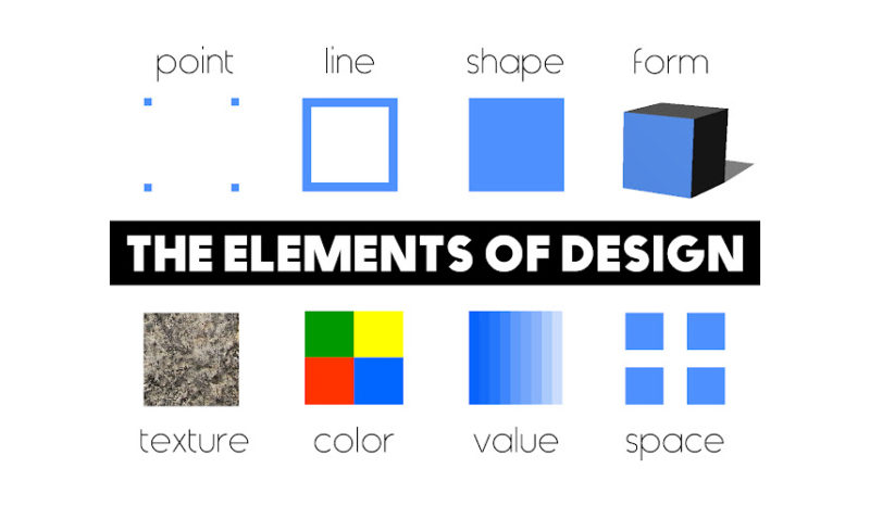
Now that you’ve spent time defining your app’s personality and how it’s going to fit into the broader market, it’s time to start putting together your design elements.
You likely won’t be doing this on your own—it’s best to work with professional graphic designers to bring these components to life.
However, you will need to be involved in the design process to ensure that your visuals are a representation of your brand as a whole.
Here are the key design elements you’ll need when building an app.
4.1 Color Palette
Apps are very visual, which is why it’s so important to have a great color palette in place.
You’ll use this color palette throughout the rest of your brand design elements, such as your logo design and app icon.
You’ll want to choose several colors to be part of your overall color palette.
Your colors need to balance each other out—they can’t all be dark colors or all be neons, for example.
You’ll always need at least a few neutrals in your color palette to provide balance for these stronger colors.
When choosing colors for your app, consider which emotions are associated with which colors.
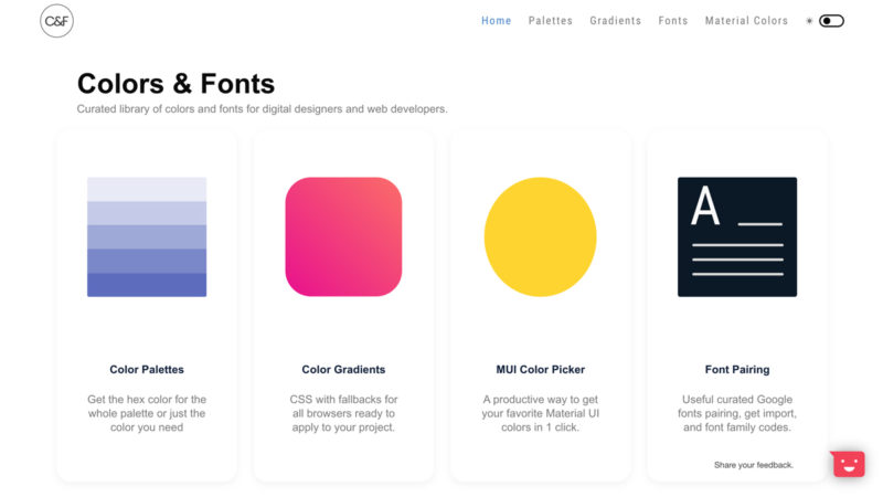
For example, blues are often associated with feelings of calm and relaxation, while oranges and yellows are often associated with creativity and learning.
Keep in mind that there are both pros and cons to every color.
For example, red is a very vibrant color that can evoke excitement and passion, but it can also make people feel overwhelmed or even angry.
The specific shade of each color that you choose can make a big difference as well. For example, light blues often come across as very relaxing, while darker blues can feel cold.
Your color palette should be one of the first steps in the brand design process.
Having an established color palette that you feel confident in will make it much easier to work with a designer in the future.
4.2 Logo
Your logo is arguably the most important design element for any branding strategy.
Logos give consumers a visual that they associate with your app.
This visual association is key for establishing brand awareness and developing a connection with your customers.
To start, try sketching out new logo ideas that you feel represent your brand. You don’t have to be a great artist for this—the key is to get the designs out on paper.
Start in black and white before adding in color.
Don’t try to go too complex with your logo, as this can overwhelm potential customers.
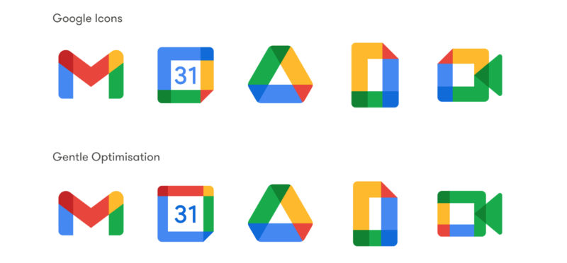
Think about some of the world’s best logos, like Microsoft, Nike, and McDonald’s.
The thing they all have in common is that they’re simple, easy to recognize, and conjure up a strong corporate identity immediately.
Once you have a few sketch ideas, you can work with a designer to bring your logo to life digitally.
Keep in mind that logos often take several revisions to get right, so be patient.
Since your logo is something that’s so deeply associated with your brand identity, you won’t want to put something out there that you aren’t fully happy with.
4.3 App Icon
Your app’s icon is another key piece of your branding. For many people, it will be the first time they’re introduced to you when they see this icon in the app store.
In many cases, your app icon will just feature just a logo.
However, many apps opt to use a letter representing their name or even a mascot instead of their logo.
When designing your app icon, remember that you’ll be working with a very small space, so it’s important to make sure the design isn’t too crowded.
![]()
Remember that your app icon will be displayed with your app name, so you don’t necessarily need to put the entire name in writing onto the icon.
However, you will need to make sure your app icon is unique enough that users will remember what it is when they see it on their phone.
Many people use a pared-down version of their logo or typography to achieve this. App mascots are also very popular, particularly for mobile gaming apps.
4.4 Typography
The typography of your app should integrate seamlessly with your logo and other imagery to create a cohesive look.
When choosing the typography, you may need to select more than one font for different purposes throughout your app.
Different fonts serve different purposes. For example, you may need a bold, eye-catching font for your splash page and other introductory imagery.
However, when you’re communicating key information directly to the user, you’ll need to use a clear, clean font that is easy to read.
Fonts serve more than just functional communication purposes.
They also have their own unique personalities that can resonate emotionally with the user.
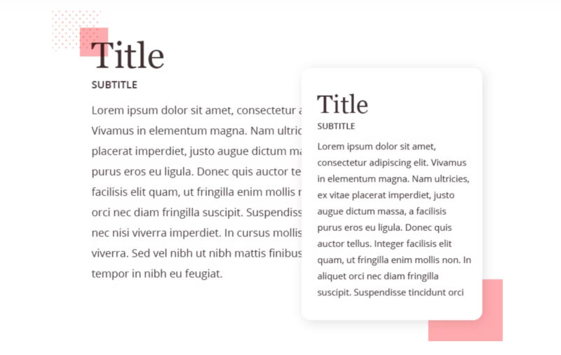
This can be a positive thing or a negative thing, so choose wisely.
You probably already have strong opinions associated with fonts like Papyrus or Comic Sans, but those aren’t necessarily positive.
While you want your typography to look chic and modern, you will also want to make sure that it won’t go out of style too quickly.
Step #5: Focus On Cohesion
Now that you have your individual brand elements worked on, it’s time to combine them in a way that’s cohesive.
Cohesion is an extremely important part of brand design.
If you aren’t able to combine key design elements in a seamless and fluid way, your app could end up feeling overwhelming or even messy to the user.
Focus on the way the elements flow together to create a smooth end product.
It’s important to remember that your brand design isn’t static. It’s something that will continue to evolve as you go forward.
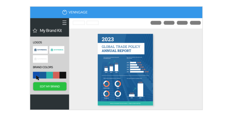
It can be very helpful to create a brand style guide to use with graphic designers and other employees in the future.
Your brand style guide will define your personality and messaging as well as outlining key style components such as the typography and color scheme.
Don’t be afraid to re-evaluate your brand identity as your app evolves and you release updates.
Ultimately, the app is for the user, so you’ll need to make sure that it’s catering to them and meeting their needs.
Checking in with your user base regularly is a must as your brand identity grows and changes.
Final Thoughts
When you begin the app development process, don’t neglect creative services like brand design elements.
Your visual brand identity design is what is going to make the strongest emotional connection with your users.
It’s also what makes you stand out in an increasingly crowded field.
Once you have your key brand design elements in place, you’ll be able to move forward and take the next steps in marketing your app.

Your inbox wants some love.
Stay informed with Webiotic latest


0 Comments