Updated
11 min read
A Guide to Mobile Banking App Development

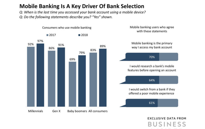
Compared to traditional banking methods, mobile banking is becoming more and more popular.
It’s fast, it’s easy, and above all—it’s convenient. And at the end of the day, people want convenience, especially when it comes to banking services.
So how can you develop a mobile banking app?
And what are some of the changes and interesting points of development that the more popular banking apps have put into place?
In this article, we’re going to cover what the most popular mobile banking apps on the market are, must-have features and UX/UI design, and how the process for mobile banking app development works.
Table of Contents
- The Biggest, Core Features of Banking Apps
- Up to Date Balance/Checking Account Information
- Mobile Deposits, Bank/Account/Personal Transfers
- Digital Wallet Integration and Contactless Payments
- Good User Experience and User Interface for Banking Apps
- Clean User Interface
- Security and Authentication Features
- Increased User Efficiency
- Three Best Mobile Banking Apps and How They Succeed
- Capital One: Great Versatility and Usefulness
- Chase: Integration with Investments: Unbelievable Number of Features
- Discover: Tons of Rewards for the User
Chapter #1: The Biggest, Core Features of Banking Apps
There are a few core features that pretty much all big banking apps have.
These are important to list and note, because it shows what people use the most as well as what they expect a mobile banking app to offer if they were to use one.
1.1 Up To Date Balance & Checking Account Information
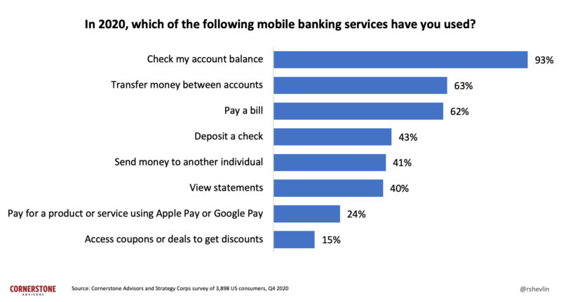
If you use a banking app, you would expect to be able to get up-to-date information about how much money you have in your account as well as pending transactions and debits, and various other similar information.
It goes without saying that any kind of banking app that doesn’t have this would definitely have an issue, which is why they all possess this feature.
1.2 Mobile Deposits, Bank/Account/Personal Transfers
Another common banking app on mobile devices are deposits and transfers.
Most mobile banking apps are built or based off of online banking applications that people use on laptops or desktop computers.
These kinds of transfers have been standard for years, and there won’t be any changing that.
Users will expect your banking app, if you make one, to support these kinds of transfers and deposits, as they’re very commonplace.
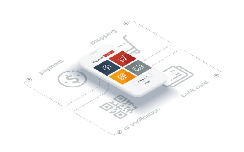
1.3 Digital Wallet Integration and Contactless Payments
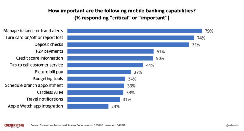
In an era where convenience meets technology, digital wallets have emerged as a go-to for many.
Integrating them into banking apps just makes sense.
By doing so, users can link their bank accounts or cards seamlessly, transforming their phones into payment tools.
This not only offers a smoother shopping experience but also minimizes the need for physical cards.
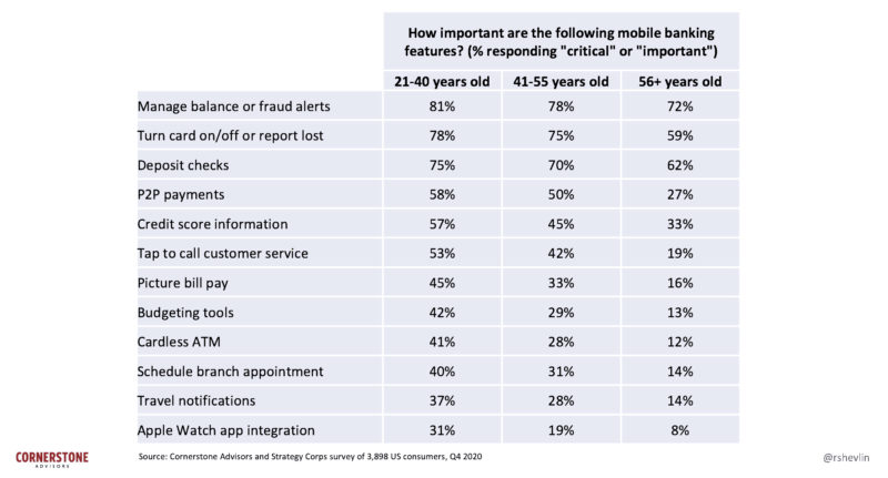
Plus, with a surge in health consciousness, contactless payments have become a preferred choice, reducing direct contact in transactions.
On top of that, these payment methods aren’t just about ease; they come fortified with multiple security layers, making each tap or scan just as safe, if not safer, than traditional payment means.
Chapter #2: Good User Experience and User Interface for Banking Apps
So we’ve been over some of the most common features that mobile banking apps have for their users.
Another important part of these applications, however, is the design and the kind of user interface that they choose to present to those who use them.
A good user experience could be most easily defined as qualities and specific aspects of the application that lead to the user having a ‘good experience’—so something like having no bugs in your mobile application could technically be considered that.
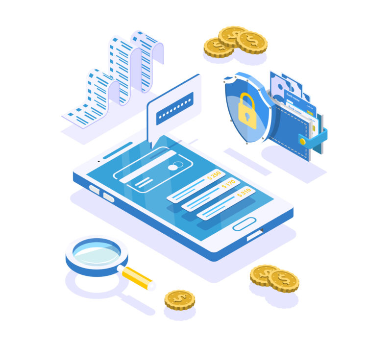
Another way to define it is anything or everything that affects the interaction and perception that a user has with a product, or in this case, an app.
Good UI/UX are intertwined. Let’s look at some top aspects for this part of mobile apps.
2.1 Clean User Interface
A great user interface, or UI, is key for a great user experience.
A good UI only has to do a few things right for that portion of the app to be successful, but despite this, many apps fail to deliver on this aspect.
For the UI to be exceptional, it must give clear information to the user, even when the user may not always understand what they themselves are looking for.
In short, you need to anticipate the needs of the user and solve them ahead of time: thus also creating a good user experience.
Say you were making a mobile banking app and someone wanted to send some feedback.
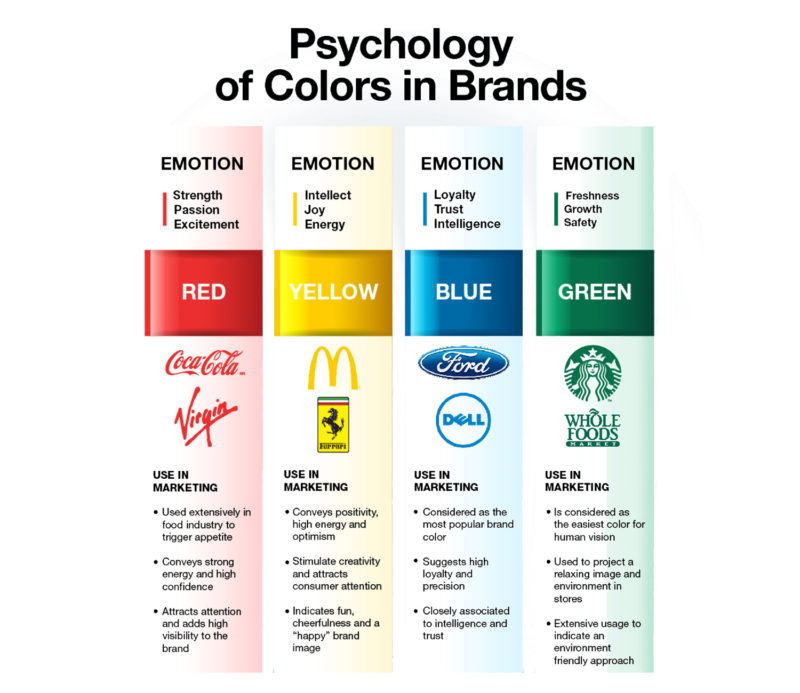
You could mark something as a contact form and they could use that.
You could also embed a hyperlink into some of the content on the app to direct them to the contact form, in the form of common messages at the end of transactions or tasks.
In the latter example, even if the user doesn’t understand where the contact form is, they’ll be able to send their message because the system sends them there.
And as always, mobile banking apps should be free of bugs or hidden information: it does no good to create something like a mobile banking app if there is no way for the user to access the information.
PRO TIP:
Remember, users want to feel secure when using a mobile banking app. Having bugs present will not only create a poor user experience but it will also make users feel unsafe using your app for financial services.
2.2 Security and Authentication Features
In the world of mobile banking, securing user data and funds is critical.
As cyber threats advance, banking apps need to stay ahead to hold onto user trust.
Authentication, a pillar of app security, has moved beyond just passwords.
Multi-factor authentication (MFA) is now common, combining things like a password, device possession, and biometric data for access.
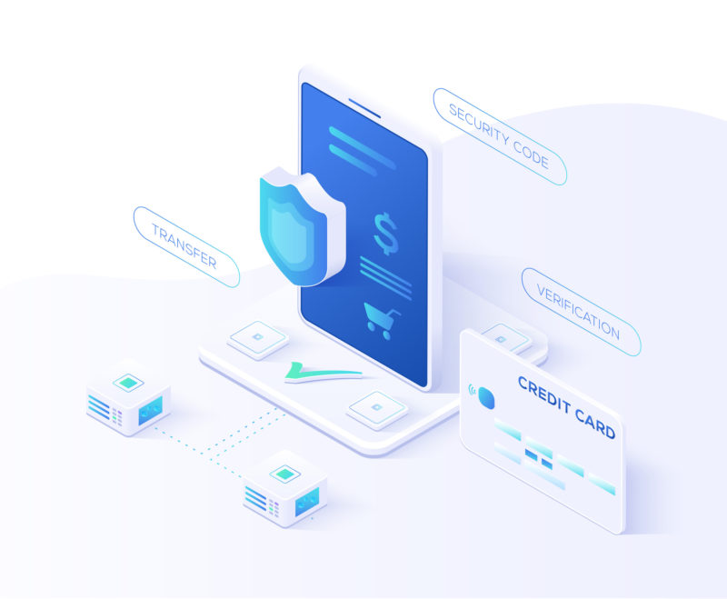
The rise of biometrics, like fingerprint and facial recognition, offers both convenience and heightened security.
End-to-end encryption ensures data transmitted between the user’s device and bank servers remains shielded from prying eyes.
Features like auto-logout, remote session termination, and real-time fraud alerts further bolster this security infrastructure.
2.3 Increased User Efficiency
Helping a user increase their efficiency and assisting them further, wherever possible, is another way to make your mobile app flexible and have sticking power, along with a great user experience.
It’s important to note that people remember things like this, even if it may seem like they don’t.
Let’s use a real life store as an example. Say you only went to Walmart for groceries and you didn’t know you could buy tires there.
Now, this is a bit ridiculous since most people would be aware of such a thing, but if you used a service or product for one narrow purpose and then found out, or were told of greater flexibility, you would appreciate the time saved or the extra choice available to you whenever visiting.
Apps are no different to the human brain: they are a store, or a game, or a service or anything else. In the case of banking apps, being able to not only do normal banking things but request and send money with Zelle, for example, is very useful. Some people prefer to use Zelle versus Venmo or Cashapp.
You’ll want to make sure that you make users feel like your service gives them no issues and assists them as much as possible, every step of the way.
You’ll have a great user experience and user interface if you follow that trend.
Chapter #3: Three Best Mobile Banking Apps, and How They Succeed
To finish things off, we’re going to go over some of the three best mobile banking apps and how they succeed at serving and satisfying their customers and users.
3.1 Capital One: Great Versatility and Usefulness
Capital One is a great banking app to use for a lot of different reasons, but some of the biggest are because they allow integration with several different other services on your mobile devices.
These are things like being able to check your credit score (and perform other credit tasks), redeem credit card rewards, view multiple account balances at the same time, and view push notifications.
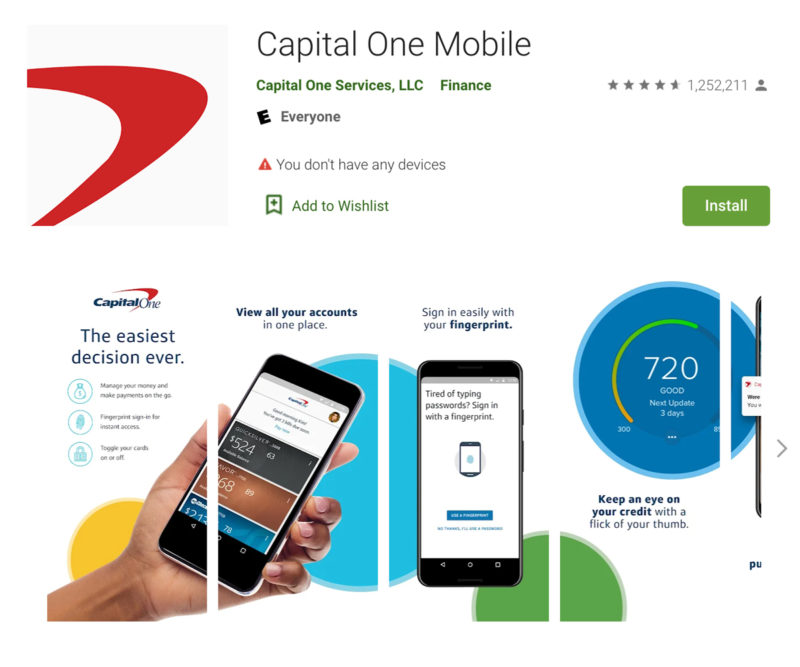
That’s to say nothing of the ability to easily keep track of your purchase history or fight fraud in real time with the click of a few buttons.
Capital One offers one of the greatest mobile banking apps due to its versatility and usefulness, along with having a slick and easy-to-understand UI.
3.2 Chase: Integration With Investments: Unbelievable Number of Features
Chase is one of the biggest banks in the world.
It’s a massive financial institution that has a finger in just about every pot you could think of. Naturally, it also has an amazing mobile banking app experience, because a bank that big needs to have great phone representation.
Chase has integration with investments, the ability to pay friends, relatives, or acquaintances with Zelle, as well as other great features like automated bill payments.
Redeeming credit card rewards or viewing your credit score is also available here.
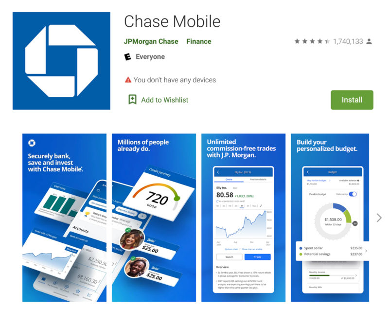
One edge that Chase has over Capital One is the ability to load a prepaid card with a few simple clicks if you use the service.
Chase has a number of other useful features that most modern banking apps have, but just the addition of the above features is reason enough for it to be on this list among these other two.
It’s a great example of a well-designed banking app.
3.3 Discover: Tons of Rewards for the User
Discover’s biggest claim to fame, in this sense, would be the fact that it offers great rewards for the user.
Discover’s credit card rewards are generally pretty good, and if you’ve got the app, various different notifications and deals are available through it.
You’ll be able to access the most up-to-date versions of any kinds of promotions and offers that Discover gives to their customers, which can sometimes be substantial.
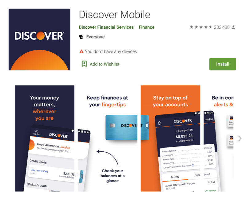
So on top of getting card rewards, you’re able to access all of their other best promotions and offers that they have for their platform and systems.
Discover is a great example of how to do a mobile banking app the right way because customers are rewarded for interacting with the software, and that keeps them coming back.
Final Thoughts
If you’re looking into mobile banking application development, it’s important to keep all of the above information in mind.
Not only should your banking app have all of the core key features that people expect, it needs to be polished, easy to use, and have a high level of quality in all aspects of its use and presentation.
If it’s any less than that, it’s unlikely that your app would be able to compete: the other players in the game are already focused on creating the best app possible.
You’ll have to match them to keep pace.
Even if you don’t want to develop a banking app, this information holds true for other kinds of mobile apps as well. Focusing on a good user experience and user interface is key for the success and longevity of your app.
Let us help you get started with our Simple Starter package which includes key moving parts in the app development process like a technical writeup, wireframes, and research.
What will set your mobile banking app apart from the competition?


Your inbox wants some love.
Stay informed with Webiotic latest





0 Comments