Updated
20 min read
How to Build a Mobile App Brand – The User is the Boss
The first rule of app branding is: you do not talk about app branding – just kidding!
The first rule is – the user is the boss.
Same goes for the second rule and the third rule and so on. Basically, what you need to know is that creating a user-centric approach when developing a mobile app branding strategy is key.
Where a lot of developers and entrepreneurs get things wrong in their branding is not valuing the user and their opinions over their own.
This means logo, graphics, colors, fonts – everything needs to be approached from the lens of your app’s target user.
In this article, we’re going to uncover why a user-centric approach is best when creating a brand for your mobile app and how you can do it.
Importance of Branding in Mobile Apps
Building a brand for your mobile app is just as important as building the app itself. It’s a crucial component of an app’s success because branding (when done right) can give your app real human value.
It creates associations with your app when someone sees the logo or when they hear a sound from the app, like a notification alert. It helps users easily recognize your app.
Some app icons, for example, are so, well, iconic, that a user barely has to look at it to find it in their phone.
If I asked you to draw the Facebook app icon or the Instagram icon, do you think you could do it?
If you use an app frequently and you can’t reproduce some resemblance of the logo or app icon, that app is doing something wrong.
The idea is to create a brand image people will remember.
Colors, fonts, graphics – all of these design elements are a part of establishing a good branding strategy for your mobile app.
At the Center of it All – The User
Before we look at some of the strategies of branding, let’s talk about the user and why a user-centric approach is necessary for successful mobile app branding.
You know how companies will often say “the customer is always right” or “the customer is king”? This is because they understand the importance of keeping the customer, or user, at the center of their business model.
When you’re developing a mobile app strategy, you have to also incorporate the user wants and needs into that strategy. It will help you create a successful user experience.
This means accepting the fact that building a brand isn’t about what you like, but rather what your users like. This is what user-centric branding means.
In this chart below from Statista, you can see the number (in billions) of annual app downloads each year.
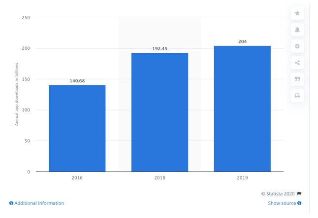
If you’re wondering how on earth you can compete with these numbers, well, it all starts with effecting mobile app branding.
Let’s take a look.
Understand your audience
Before setting out on building a brand for your mobile app, the first step is to understand who your target audience is.
- In short, who is your user?
- What do they look like?
- What’s their annual income?
- Do they use iPhone or Android?
- Are they a male audience, female, both?
- Are they an older audience or younger?
Asking these kinds of questions and more will help you pinpoint your target audience so you can build your brand around that group’s likes and wants.
For example, if you have a medical delivery service mobile app where the user age group is 50-70 years old (according to your very thorough research), do you think it’s a good idea to create an app logo or icon with bright pink hues and frilly font styles?
No way!
Even if you personally love pink, that’s not what the geriatric crowd will expect of a medical delivery service app.
In fact, the healthcare industry uses blue as its primary color in 85% of logos. And there’s a lot of logic behind this. Colors in branding aren’t arbitrary.
Blue represents tranquility, knowledge, security, and trust—all things you want in a medical/healthcare-related app.
Check out this chart by 99 Designs.
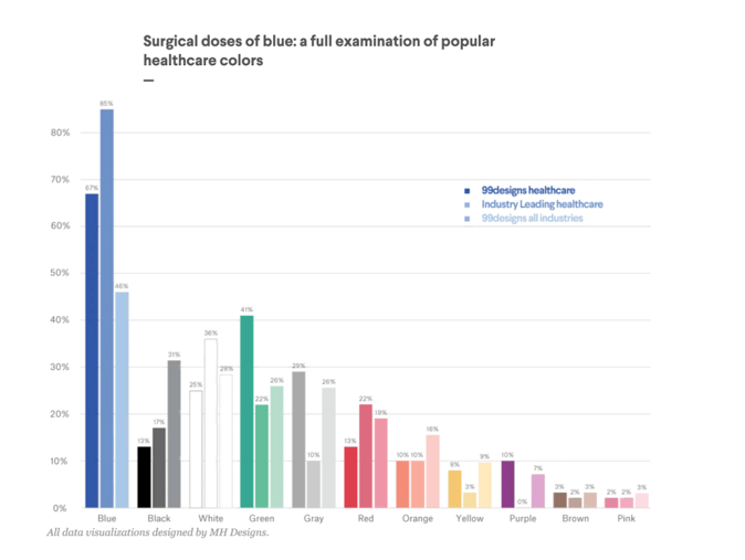
See what color is least used in healthcare? Pink!
Mobile App Branding Strategies
The purpose of creating a strong app branding strategy with a user-centric approach is to both attract and retain users. You want to lure them in and keep them coming back.
You already know that keeping the user at the center of your branding strategy is key, but what other strategies can you leverage?
Scope out the competition
You never want to copy the competition’s branding, of course. Remember, the idea is to create a branding strategy that is unique to your app.
But taking a look at the competition is part of the research involved in building that strategy.
Browse through popular apps that share the same category as your mobile app and take note of their various branding elements.
Can you identify any shared qualities between your competitors that you might benefit from incorporating yourself, like a common color palette for your specific industry?
Checking out the competition can also simply help you find inspiration.
Keep it fresh
I already said it, but I’ll say it again: be unique. This doesn’t mean going against what research tells you (like how blue is the most popular color in healthcare).
You don’t want to ignore the trends in industry branding, but you do want to ensure your app design, including your icon and logo, is fresh, modern, and above all, unique.
Avoid common cliches, like using a light bulb design to represent ideas or letters to represent email, and so on.
When building a brand, there’s room for experimentation (depending on the industry), but the idea is to keep things simple and clean, yet interesting.
Keep it simple
Simplicity is a big part of mobile app branding. When you present a new app idea to a user, it’s always going to be confusing or complex. Try discussing your app idea with a family member.
You’ll probably have to explain how the app would work and what it does and even answer some questions. This is normal!
When developing your mobile app, including the branding, it’s important to refine your ideas into a simple, easy-to-use, easy-to-understand mobile app.
Design plays a big role in this. Various design elements like color schemes, images, and icons are an integral part of creating your brand, but they need to be designed so that they create a simple and intuitive user experience.
There’s always some leeway to get creative with your branding, but some things shouldn’t be messed with.
For example, if you look at icons used in apps, like the hamburger menu, shopping cart icon, etc, you’ll notice that their design doesn’t change much from app to app.
This is the same reason why you can jump into pretty much any car, whether it’s a Ferrari or Toyota, and drive it with ease.
The steering wheel, stick shift, pedal placements—they’re all the same across different vehicles, which is on purpose.
This kind of functional uniformity helps users jump right into the layout and flow of an app with ease.
Doing otherwise could lead to confusion and frustration.
Bug-free
The last thing you want is for users to associate your brand with crashes and bugs and constant bug-fix updates every day.
Even if you have an app that solves your users’ problems, if it’s constantly crashing or having issues, this will create a poor impression about your brand which of course will affect user retention and engagement.
Be sure to conduct testing throughout the development of your app. Remember, testing is constant and should never stop. This is the only way to ensure you have a high-quality app.
While bugs happen, you want to minimize their occurrences so you don’t have to pester users with constantly updating their app. That can get annoying very quickly.
User interactions
You want your users to interact with your app. Introduce features like badges, ratings, reviews and notifications to motivate your users to come back.
Spending time on brand awareness and brand styles will help you with this goal and make your app more recognizable for users.
Icon and Logo
While some companies will use their logo as their mobile app icon, this generally isn’t a good idea.
A part of your mobile app branding strategy should focus on creating an app icon that represents your brand which should be separate from your logo.
If you take a look at the apps in your phone, you’ll quickly notice how all the icons are the same size and have that rounded-edge shape.
In fact, iOS apps have a set of guidelines for how app icons should look.
Here are some quick rules:
- An app icon should be simple but unique
- The icon should have a single focus point that draws attention and helps users quickly identify the app
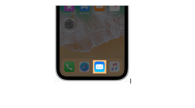
- The design of the icon should be recognizable and easy to understand (like how an envelope is universally understood to be associated with mail)
- The app should have a simple background with no clutter
- The icon shouldn’t include text unless the word(s) are part of the logo
- The icon shouldn’t include photos or screenshots
- The icon design cannot copy Apple hardware products
- The icon shape should be designed as a square (the iOS system will automatically render rounded corners)
Know How to Advertise
There are a lot of nuances to advertising your brand correctly on various social media platforms, but the takeaway here is that you want to be efficient in your strategy.
Bringing brand awareness can be achieved through methods like Facebook Ads, but you want to make sure you’re targeting the right group, otherwise your money will be wasted.
Remember, your mobile app isn’t valuable to everyone.
This concept has a lot to do with identifying your target audience. These are the users you want to alert about your brand and mobile app.
Personalization
Personalizing the mobile app experience is a big part of building a user-centric branding strategy.
It’s about creating a relationship with your users, which of course will lead to brand loyalty and user retention.
Leverage the data and analytics available to you to attract users based on their preferences.
Once you have users, keep them with personalized messages, profiles, notifications, advertisements, and so on.
Create a memorable app name
What’s in a name? A whole lot, actually.
While the app’s overall design along with the logo and icon are important pieces of building a brand, choosing the right name for your app is just as crucial.
Here are a few strategies that will help you come up with the perfect app name:
- The name should reflect your app’s core features. Just like the app icon, a name should help a user understand what the app is about.
- Try a play on words. You’ll notice many apps will use a play on words to convey what the app does. Like the GPS app Waze is a play on the word “ways”. This could be one method in which to differentiate your app.
- Keep the name short and memorable. Most names for apps are just one or two syllables max, like Uber, Tinder, SnapChat, WeChat, and so on.
- Pick a name that is searchable since most people find apps through searching online.
- Consider names that are obvious for your type of app, like Tasker for a task management app, for example.
- Consider a name that elicits emotion from users. MyFitnessPal, for example, has a warm, friendly feel to it because it has the word “pal” in it. It’s an app that’s there to help you out, like a pal.
- Above all, pick a name that represents your app. You don’t want users to feel misled by your app name. The name you chose should accurately represent what your app does.
Final Thoughts
Creating an effective mobile app branding strategy is something that takes time. It’s a thoughtful process that incorporates a variety of factors to get real results.
If you want to create a brand for your app that will draw and keep users, pay close attention to design elements when creating your logo, icon, and app, personalize your branding, see what the competition is doing, and above all, keep the user front and center, always.


Your inbox wants some love.
Stay informed with Webiotic latest


0 Comments